
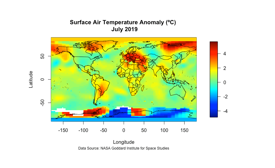
In this project I utilized R Studio and data acquired from NASA’s GISS Surface Temperature Analysis to map the global surface air temperature anomaly for July of 2019. This project involved accessing data via a NetCDF (Network Common Data Form) file, processing and cleaning the data, then creating a geographic visualization of said data within R Studio. Below I have shared the final visualization and the code I used to create it.
### Visualizing Temperature Anomaly Using R Studio and NetCDF Data

# Set working directory

setwd("~/Documents/Projects/NetCDF/Temperature Anomaly ")

# Load libraries

library(fields)
library(maps)
library(mapdata)
library(readr)
library(dplyr)
library(devtools)
library(ncdf4)

# Load NetCDF file and variables

f <- nc_open("gistemp1200_GHCNv4_ERSSTv5.nc")
Latitude = ncvar_get(f, "lat")
Longitude = ncvar_get(f, "lon")
anom = ncvar_get(f, "tempanomaly")
tm = ncvar_get(f, "time")

# Time is saved within the NetCDF as "months since 1800-01-01. To convert this to an actual date we do the following:

tm = as.Date(tm, origin = "1800-01-01", tz = "UTC")

# Convert temperature anomaly from Kelvin to Celsius

anom <- anom - 273.15

# Currently anom data is in three dimensions (lat, long, tm); however, to map the data we want it to be in two dimensions. To do this, we need to grab a slice of the data. I decided to grab a data slice for July of 2019 which is 1674 months since January 1880.

anom = ncvar_get(f, "tempanomaly", start = c(1,1,1674), count = c(-1,-1,1))

# To make a simple visualization we can use the image.plot function and add a country boundary base map, title, and citation.

image.plot(Longitude, Latitude, anom)
map(add=T)
title(main = "Surface Air Temperature Anomaly (ºC) \n July 2019",
      sub = "Data Source: NASA Goddard Institute for Space Studies", cex.sub=0.75)