
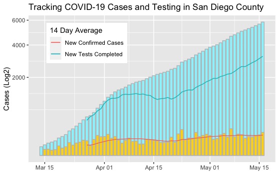
I have been trying to find a rolling 14 day average of new COVID-19 cases and tests for San Diego County. I like the 14 day average because it helps to cut through some of the noise and illustrates the long(ish) term trends in the data. Ultimately, I was unable to find what I wanted so I did the logical thing: make it my self and practice processing and visualizing data in R Studio while I am at it.
Through completing this project I was able to practice what I have already covered through the HarvardX Data Science course on EdX and learned a few new skills on the way. These included measuring central tendencies using the tidyquant package, conducting rolling window calculations, and how to superimpose a line graph over a bar graph using ggplot.
One thing that I struggled with and ultimately failed to figure out was how to generate multiple legends on the same plot. I could create a legend for the bar graph or the line graph; however, I couldn’t figure out to how to plot both at the same time. If you have any advice, I would love to know how to do this within R so I can make the graphic easier to interpret.
library(dplyr)
library(dslabs)
library(tidyverse)
library(tidyquant)
library(ggplot2)

Date <- seq(as.Date("2020/03/14"), as.Date("2020/05/16"), by = "day")
Date

TotalCases <- c(25, 37, 50, 59, 70, 100, 118, 143, 197, 232, 283, 341, 417, 488, 519, 603, 734, 849, 966, 1112, 1209, 1326, 1404, 1454, 1530, 1628, 1693, 1761, 1804, 1847, 1930, 2012, 2087, 2158, 2213, 2268, 2325, 2434, 2491, 2643,2862, 2943, 3043, 3141, 3314, 3432, 3564, 3711, 3842, 3927, 4020, 4160, 4319, 4429, 4662, 4776, 4926, 5065, 5161, 5278, 5391, 5523, 5662, 5836)
DailyTests <- c(14, 25, 25, 77, 143, 320, 93, 788, 422, 382, 504, 1087, 1023, 776, 1275, 687, 1538, 989, 2606, 1882, 1025, 807, 827, 1846, 842, 920, 1255, 1077, 804, 898, 919, 836, 1248, 1114, 1393, 955, 1310, 1016, 1514, 2255, 3122, 1826, 1297, 823, 2545, 1966, 2303, 2625, 2402, 2277, 1293, 2306, 2260, 3325, 3572, 3401, 3443, 2638, 2440, 3541, 3998, 4055, 4505, 4363)

NewCases <- TotalCases - dplyr::lag(TotalCases, n = 1)

SDCOVIDDATA <- data.frame(Date, TotalCases, NewCases, DailyTests)

Rolling_Averages <- SDCOVIDDATA %>%
  tq_mutate(select = DailyTests,
    mutate_fun = rollapply,
    width = 14,
    align = "right",
    FUN = mean,
    na.rm = TRUE,
    col_rename = "DT14AVG") %>%
  tq_mutate(select = NewCases,
            mutate_fun = rollapply,
            width = 14,
            align = "right",
            FUN = mean,
            na.rm = TRUE,
            col_rename = "NC14AVG")

Rolling_Averages %>% ggplot() +
  geom_bar(aes(x = Date, weight = TotalCases),
           fill = "cadetblue1",
           color = "grey",
           width = 0.8) +
  geom_bar(aes(x = Date, weight = NewCases),
           fill = "gold",
           color = "grey",
           width = 0.8) +
  geom_line(aes(x = Date, y = NC14AVG, color = "New Confirmed Cases")) +
  geom_line(aes(x = Date, y = DT14AVG, color = "New Tests Completed")) +
  ggtitle("Tracking COVID-19 Cases and Testing in San Diego County") +
  xlab("") +
  ylab("Cases (Log2)") +
  scale_y_sqrt() +
  scale_colour_discrete(name="14 Day Average", labels=c("New Confirmed Cases","New Tests Completed")) +
  theme(legend.position = c(.3, .95),
        legend.justification = c("right", "top"))